View Poll Results: Which MWC logo do you prefer?

Voters
14. You may not vote on this poll
  • Old

    14 100.00%
  • New

    0 0%
Page 2 of 3 FirstFirst 123 LastLast
Results 21 to 40 of 42

Thread: New Logo/Branding Announcement for Mountain West Conference Today

  • Share
    • Facebook
  • Thread Tools
  • Display
  1. #21
    Hall of Fame SmoothPancakes's Avatar
    Join Date
    Jun 2010
    Location
    Ohio
    Posts
    16,450
    Quote Originally Posted by ram29jackson View Post
    they shouldnt have wasted the time or money. At this rate,the conference wont exist in 5 years..Boise should have gone elsewhere too haha
    Honestly, with the way that logo looks, I don't think they spent any money on it. Just time.

  2. #22
    Administrator cdj's Avatar
    Join Date
    May 2010
    Location
    Lincoln
    Posts
    13,123
    Quote Originally Posted by PeteyKirch View Post
    It looks like the Dr. Who Tardis logo.
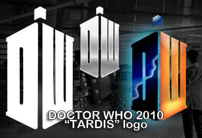
    I didn't know what that looked like, so I had to Google it....good call on the comparison:


  3. #23

  4. #24
    Administrator gschwendt's Avatar
    Join Date
    May 2010
    Location
    Raleigh, NC
    Posts
    11,221
    Quote Originally Posted by cdj View Post
    So you're saying they love to mimic other logos eh?

  5. #25
    Administrator gschwendt's Avatar
    Join Date
    May 2010
    Location
    Raleigh, NC
    Posts
    11,221
    Apparently they didn't like the mock-ups being out there for the public... they've pulled them down now.

  6. #26
    Booster JeffHCross's Avatar
    Join Date
    May 2010
    Location
    South County, STL
    Posts
    12,951
    Quote Originally Posted by Paakaa10 View Post
    Kinda looks like the Doctor Who logo to me.
    Quote Originally Posted by PeteyKirch View Post
    It looks like the Dr. Who Tardis logo.
    Yes.
    Twitter: @3YardsandACloud

  7. #27
    All-American Paakaa10's Avatar
    Join Date
    Jan 2011
    Location
    Tulsa, Oklahoma
    Posts
    1,629
    Horrible quote from the "Sign On San Diego" write-up of the re-branding here:

    Thompson said the old MWC logo was “confusing” and “very busy” with the word “West” dwarfed underneath the word “Mountain” and a mountain range. The league's old slogan -- "above the rest" -- also was a nod to member teams that played at high altitude. By contrast, the new logo gives equal placement to the “Mountain” and “West,” reflecting the addition of western schools Hawaii and Fresno State. It also looks the same upside down or right-side up.

    “The old logo was very mountain-centric,” SDSU President Stephen Weber said. “This gives equal billing to west.”
    And bad news about what it costs:

    Thompson said the rebranding cost roughly $250,000, including the logo and media campaign.

    “We’re going to put it everywhere,” Thompson said of the logo. That includes uniforms and playing surfaces.

  8. #28
    Booster JeffHCross's Avatar
    Join Date
    May 2010
    Location
    South County, STL
    Posts
    12,951
    "It looks the same upside down and right-side up" should never, every, ever be a "good" thing about a logo.

    Unless it's a circle. With no logo. Just a colored circle.
    Twitter: @3YardsandACloud

  9. #29
    All-American Paakaa10's Avatar
    Join Date
    Jan 2011
    Location
    Tulsa, Oklahoma
    Posts
    1,629
    Informal Poll (since I can't add it in officially)

    Which is better?


  10. #30
    Booster JeffHCross's Avatar
    Join Date
    May 2010
    Location
    South County, STL
    Posts
    12,951
    100% the original logo.

    Make that 200%.

    Make that infinity.
    Twitter: @3YardsandACloud

  11. #31
    Quote Originally Posted by Paakaa10 View Post
    Informal Poll (since I can't add it in officially)

    Which is better?

    I like the older one way better.
    know this might seem crazy, but this might make me want to play as a Mountain West team. I hope it didnt make it in.

  12. #32
    All-American Paakaa10's Avatar
    Join Date
    Jan 2011
    Location
    Tulsa, Oklahoma
    Posts
    1,629
    Sweet; it would appear that a helpful mod added a poll. Feel free to use that; pretty sure I know which will be more popular though.

  13. #33
    Heisman souljahbill's Avatar
    Join Date
    Jun 2010
    Location
    Baton Rouge, LA
    Posts
    6,691
    LOL! MW can be anything. How is that branding? That logo can mean Modern Warfare.


    Sent from my iPhone using Tapatalk

  14. #34
    All-American Paakaa10's Avatar
    Join Date
    Jan 2011
    Location
    Tulsa, Oklahoma
    Posts
    1,629
    As if the logo design itself isn't bad enough, it's going to be very awkward after this season when TCU leaves the MWC for the Big East and no teams left in the MWC have purple in their color schemes. It'll be like the MWC is pining away for their departed Horned Frogs.

  15. #35
    Hall of Fame steelerfan's Avatar
    Join Date
    May 2010
    Location
    Houston
    Posts
    15,391
    Yeah, my first thought (after getting over how lame the logo is) was, "why the hell are they using TCU's colors"? So much for re-branding.
    Last edited by steelerfan; 06-06-2011 at 10:45 PM.

  16. #36
    Quote Originally Posted by souljahbill View Post
    LOL! MW can be anything. How is that branding? That logo can mean Modern Warfare.


    Sent from my iPhone using Tapatalk
    It does looks like a bad company logo from the 80s-90s.
    I dont/kinda want to see how this would look on a jersey

  17. #37
    Hall of Fame ram29jackson's Avatar
    Join Date
    Jun 2010
    Location
    Southern California
    Posts
    10,052
    Quote Originally Posted by SmoothPancakes View Post
    Honestly, with the way that logo looks, I don't think they spent any money on it. Just time.
    the sad truth is..someone got alot of money for that..I'm always interested when a new sports or helmet logo comes out, who is the person that made it ?

  18. #38
    Hall of Fame ram29jackson's Avatar
    Join Date
    Jun 2010
    Location
    Southern California
    Posts
    10,052
    Quote Originally Posted by steelerfan View Post
    Yeah, my first thought (after getting over how lame the logo is) was, "why the hell are they using TCU's colors"? So much for re-branding.
    everyone uses red or blue..just trying to find a way to be different...purple mountains majesty's...

  19. #39
    wow that is a terrible logo....looks like a construction company logo or something...a perspective block logo...been done a quadrillion times....hope they didn't pay money for that design!

  20. #40
    All-American Jayrah's Avatar
    Join Date
    May 2010
    Location
    Moscow, Id
    Posts
    1,569
    Quote Originally Posted by CLW View Post
    Well if that logo isn't in 12 NCAA Football 12 = WORST GAME EVA!
    I always get a SERIOUS kick out of your posts when you put WORST GAME EVA! in them. I laugh so hard and nobody is even around me!

Bookmarks

Bookmarks

Posting Permissions

  • You may not post new threads
  • You may not post replies
  • You may not post attachments
  • You may not edit your posts
  •